Forging Elite Fitness, and Elite Beer Drinkers
Forging Elite Fitness
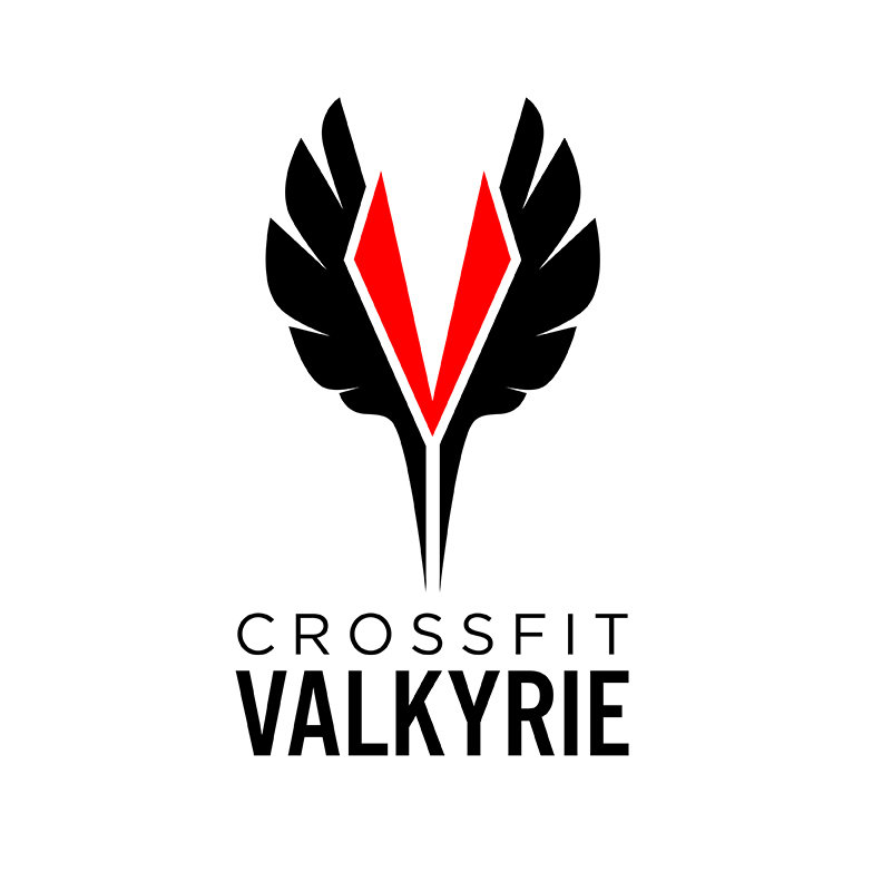
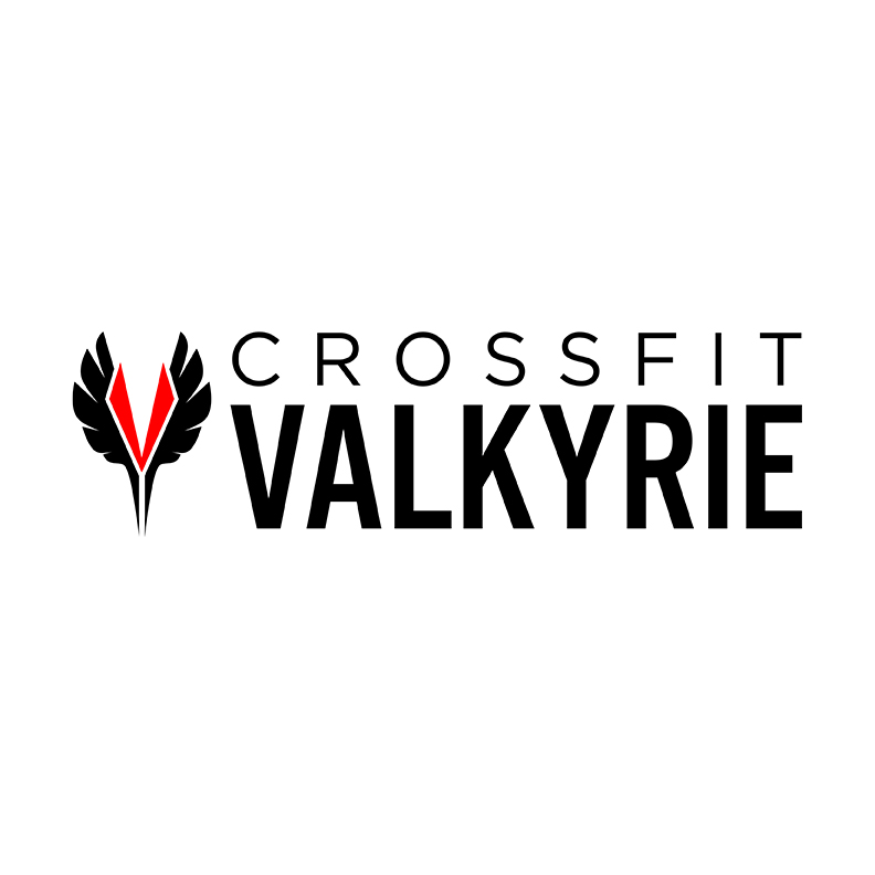
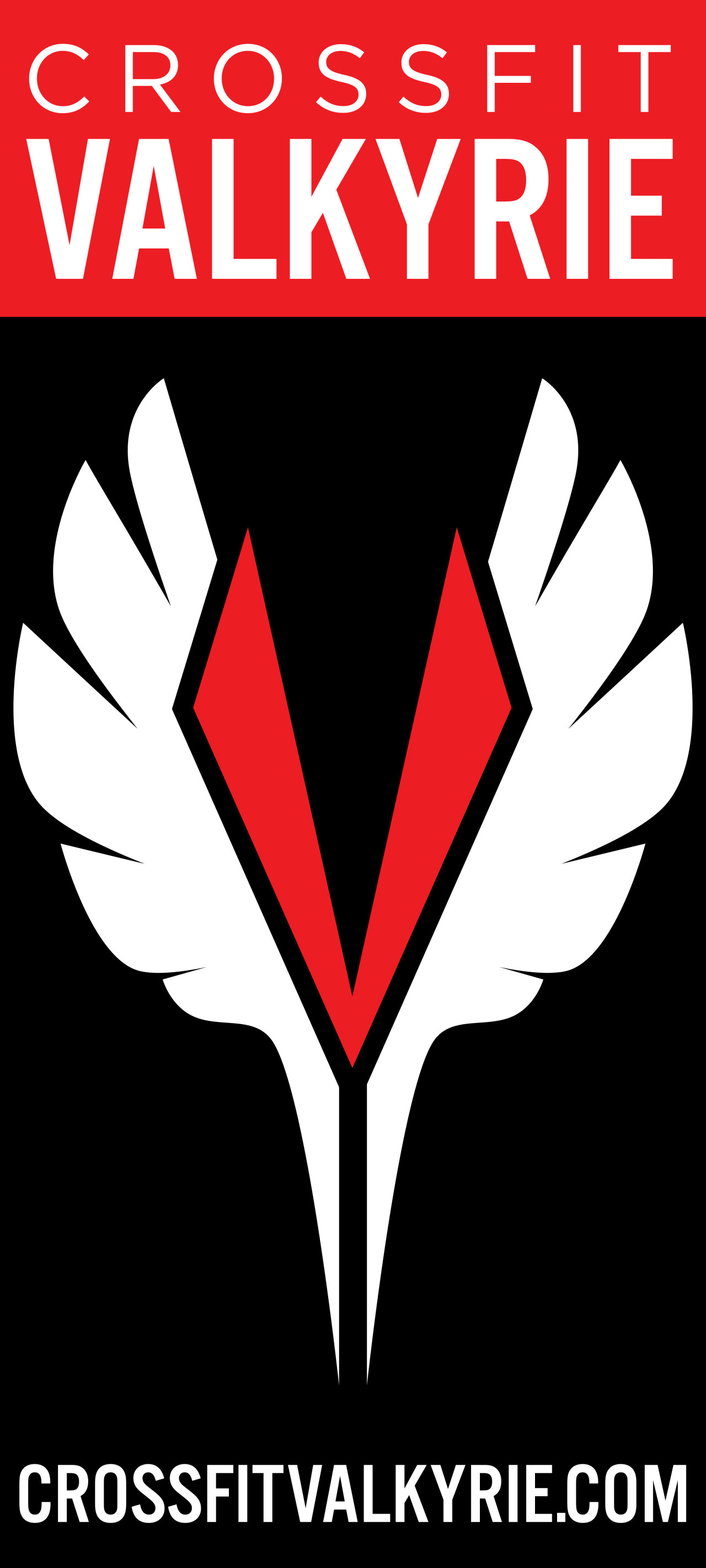
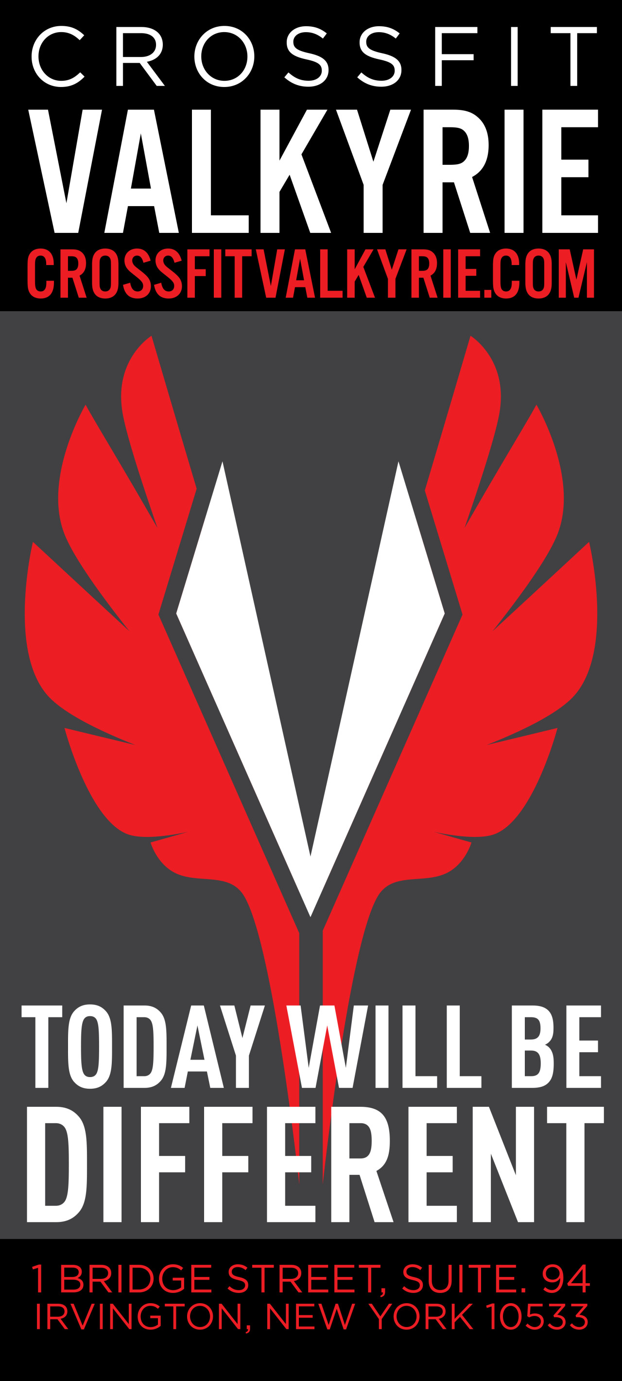
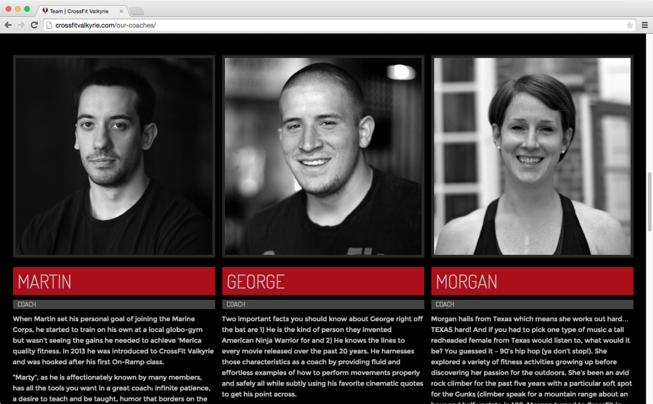
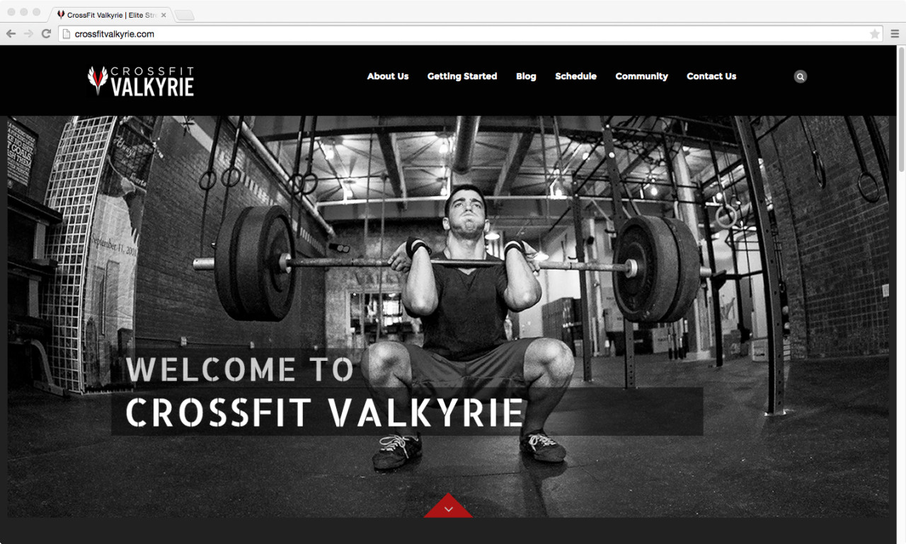
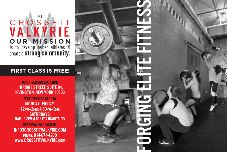
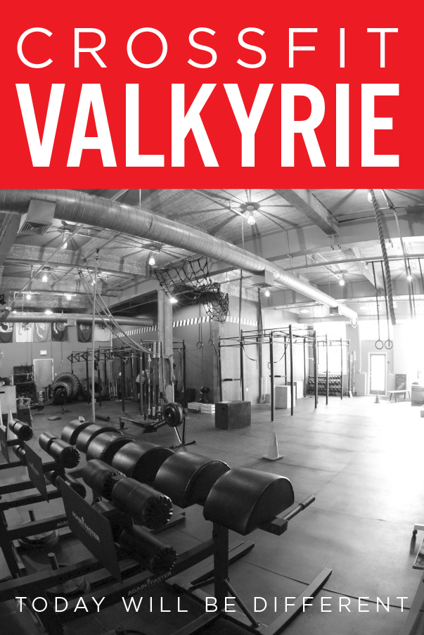
CrossFit Valkyrie had moved to a substantial location within a more affluent town—but didn’t have the polish in their branding to communicate their high standards. The logo needed to feel like a true mark—simple, powerful, something easy to recall, and individual enough to call up who they were quickly. The color palette was a fixture, so within the red, gold, and black options was born a logo that emphasized their individualized approach to CrossFit.
CrossFit Valkyrie Branding
CLIENT
CrossFit Valkyrie
YEAR
2015
SERVICES
Logo Design, Branding, Style Guide Creation, Web Design, Flyer and Advertisement Design, Photography
VISIT WEBSITE